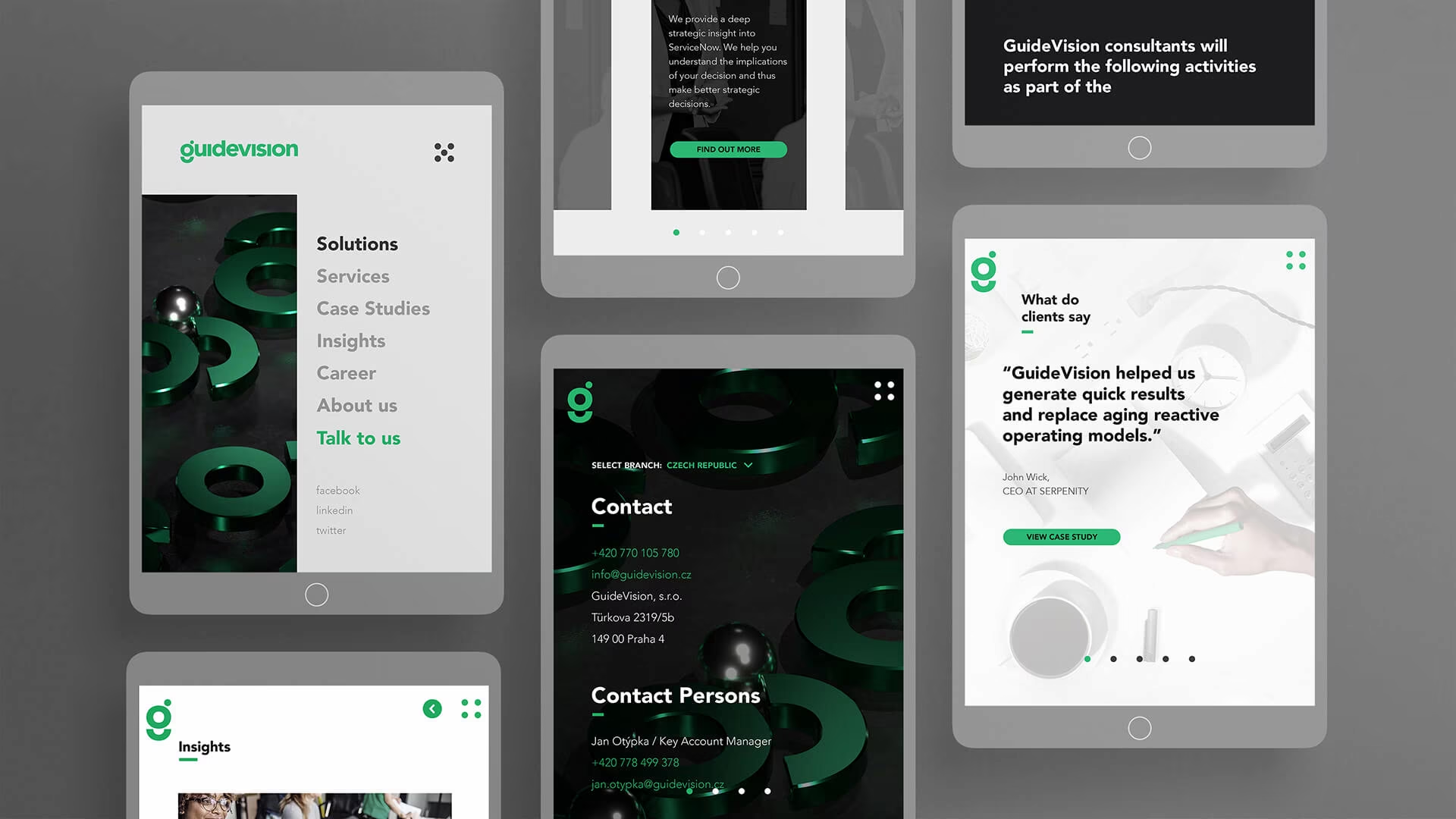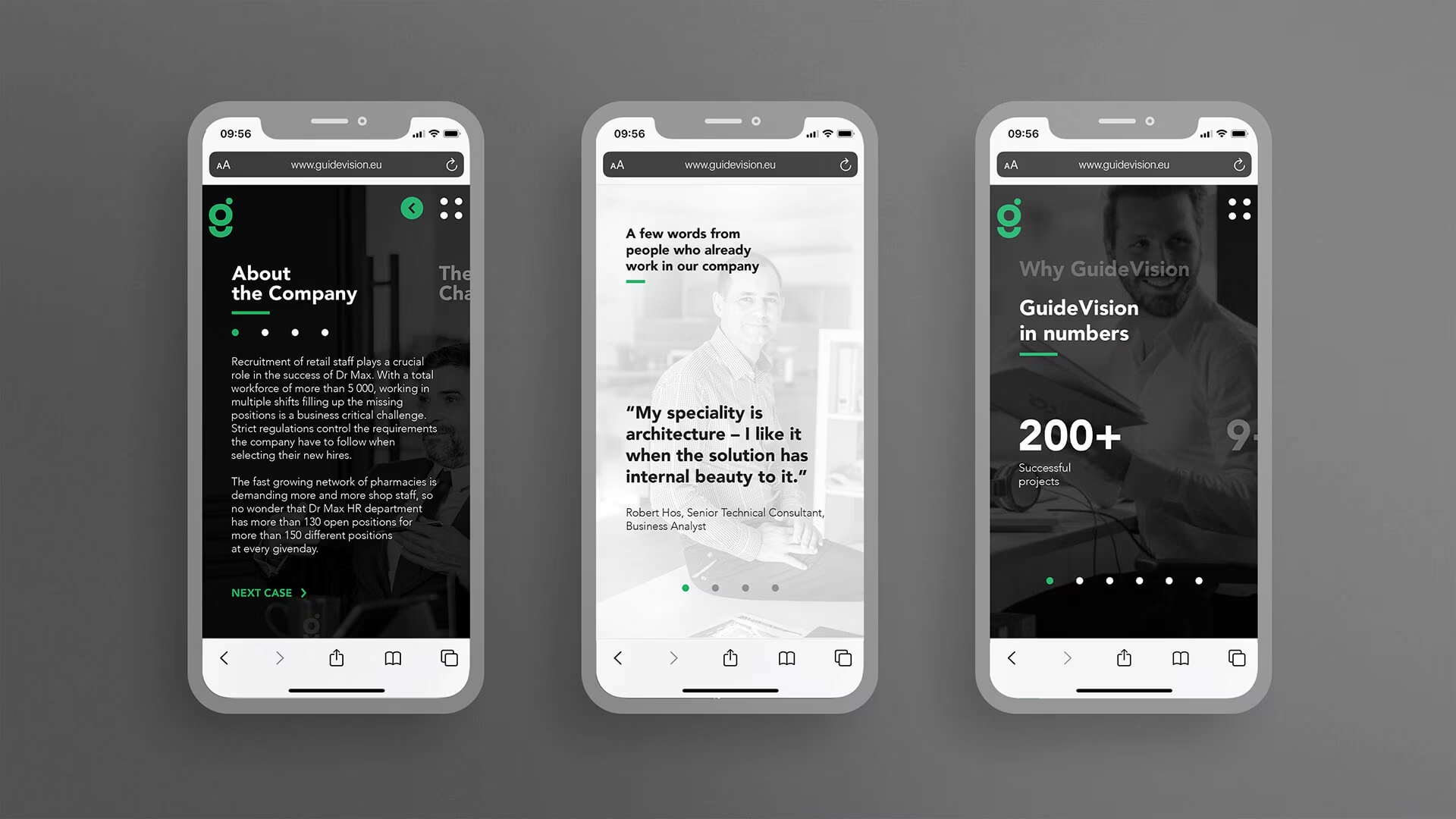
With bigger corporations often lacking some major zing, youth, and agility in the way things are run, GuideVision came up with a solution to help inject life and simplicity into companies with an easy-to-implement software. The thing is, they first wanted to incorporate that high-vibe impression into their look and feel.
Originally starting out in the Czech Republic, GuideVision wanted to shift and become a more recognizable global brand. This means establishing a completely new identity while finding the right voice and way of speaking to the public.

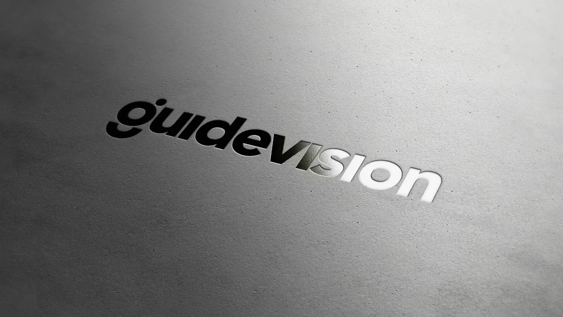
We crafted GuideVision’s entire brand identity to match their agility and energy.
By strategizing and working primarily on visual content, we put together a fresh corporate video to capture their latest visions and intentions. As for their website, we came up with a concept based on research and user-centered UX design topped off with original motion design elements.
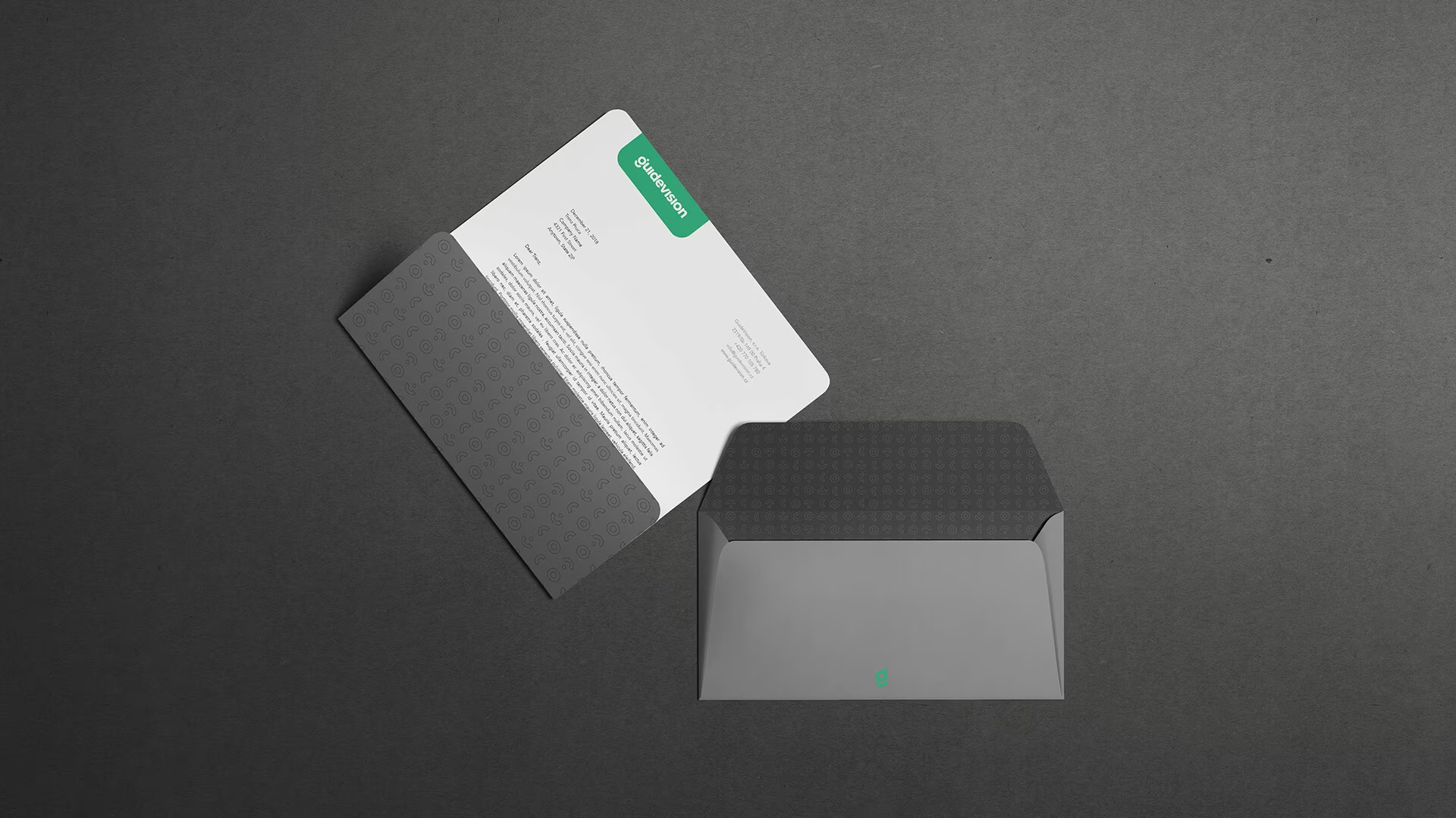
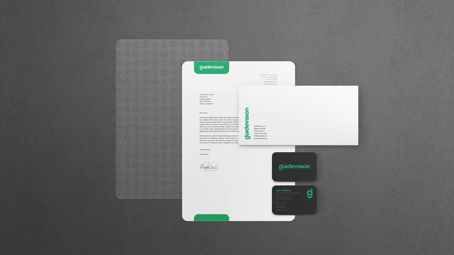
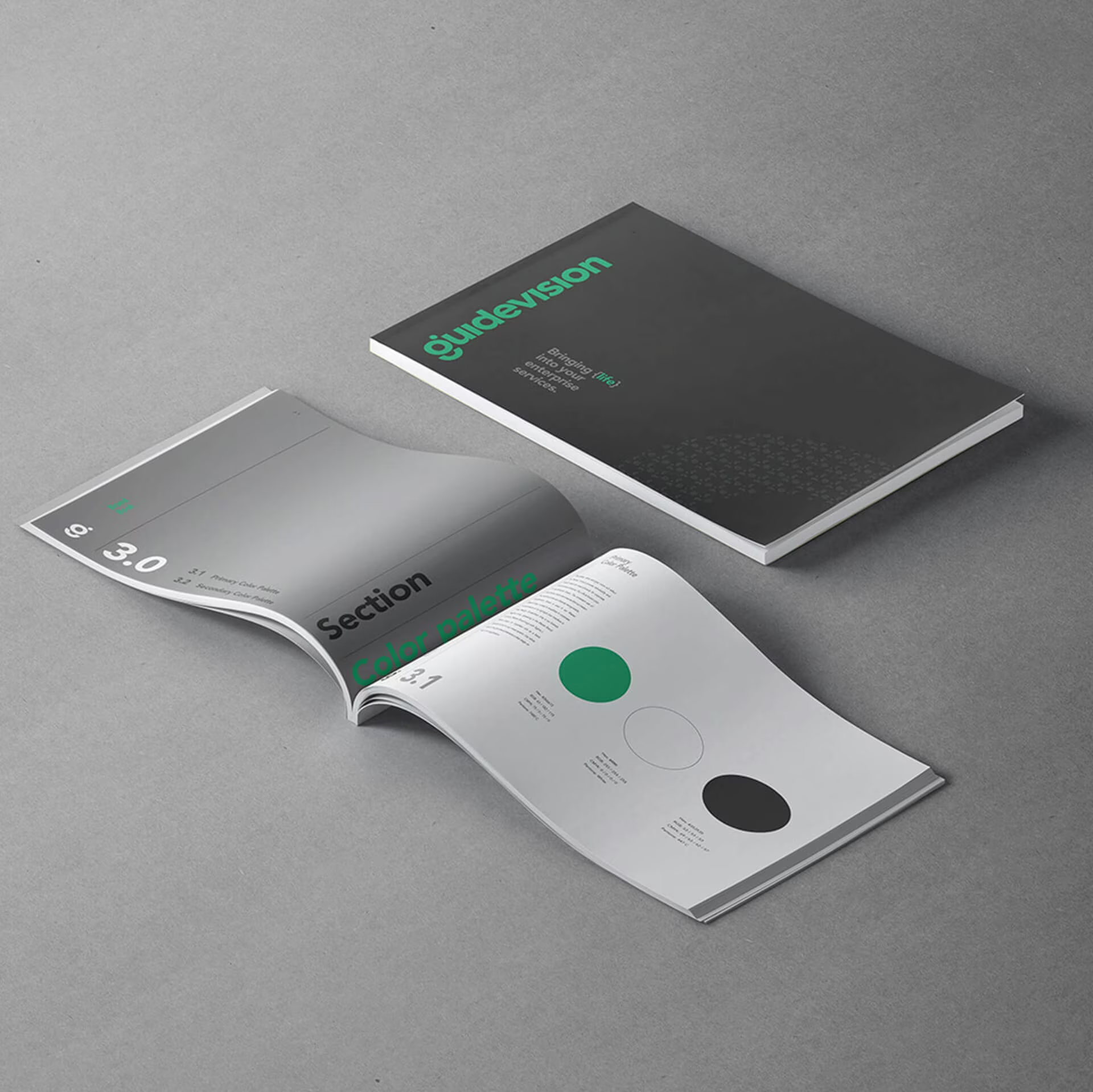
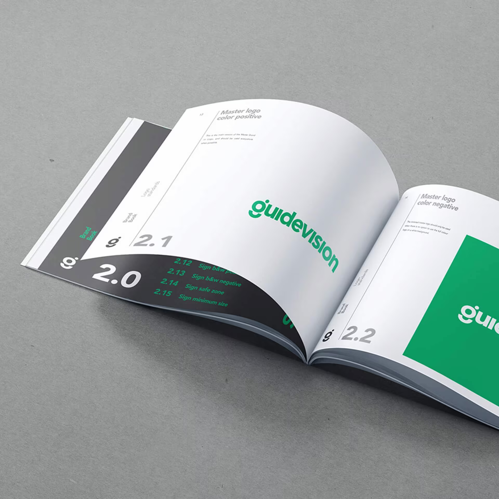


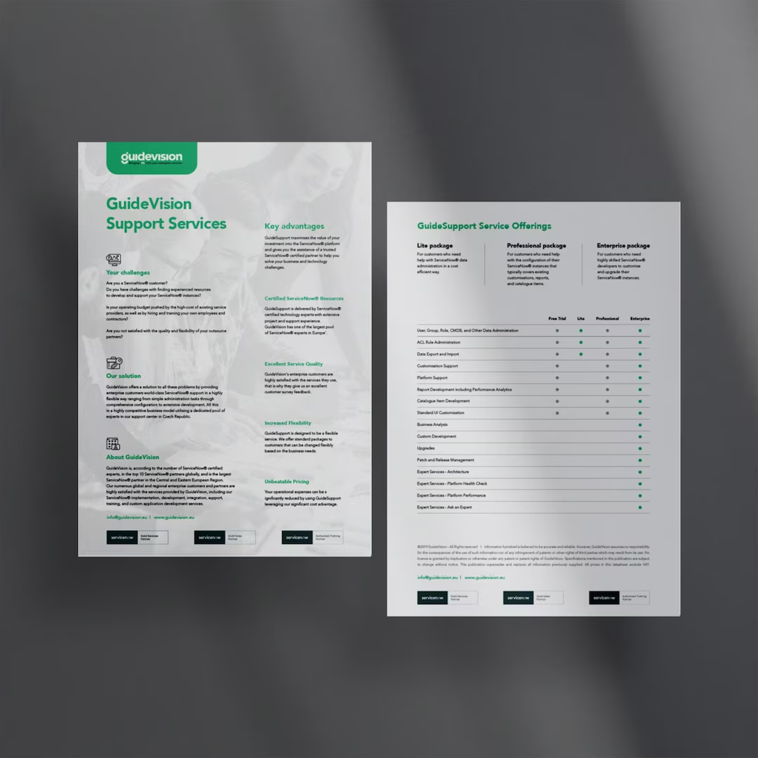
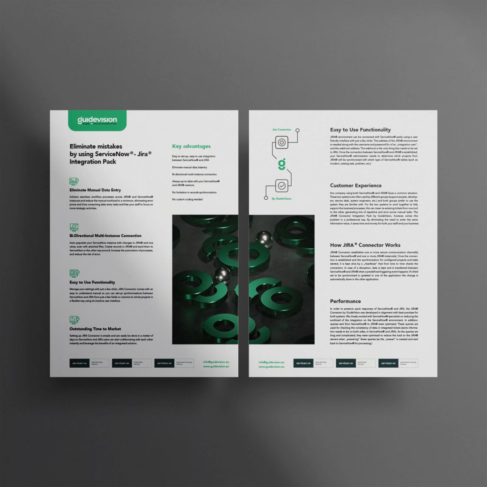
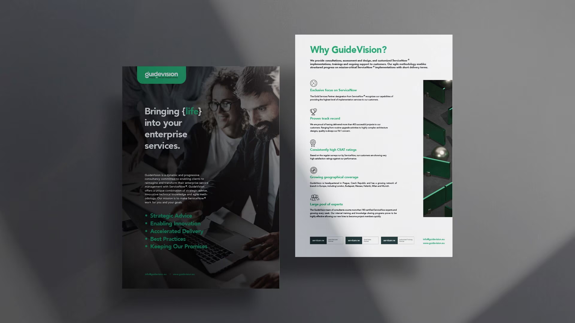
As things geared up on the screen with the introduction of new design elements, GuideVision’s level of satisfaction hit the roof. For a tech company that wants to inspire life, they’re now as visually alive, sleek, and agile as it gets.

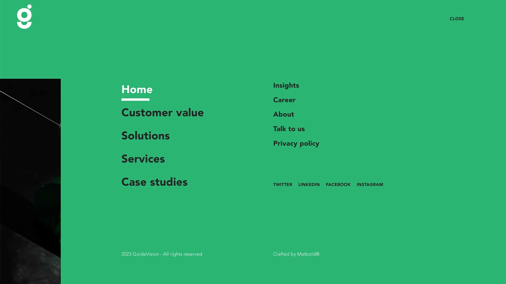
Inspiration in every detail. As things geared up on screen with the introduction of new design elements, GuideVision’s level of satisfaction hit the roof. For a tech company that wants to inspire life, they’re now as visually alive, sleek, and agile as it gets.
months of production
increase in site traffic over 3 months
online sales growth after 3 months
